
UX and UI Design: What It Is and How to Get It Right
 Vladimiros MykogianAugust 2, 2026
Great digital products are not built on code alone. UX and UI design are the disciplines that determine whether users stay, convert, and come back, or leave in frustration after ten seconds. Get both right and your product feels effortless. Get either one wrong and even solid engineering cannot save your retention numbers.
UX vs. UI Design: The Clearest Distinction You Will Find
These two terms are used interchangeably all the time, and that is a mistake worth fixing early.
UX (User Experience) design is the entire process of shaping how a person feels when they interact with your product. It covers research, information architecture, user flows, wireframes, and usability testing. UX is strategic and structural.
UI (User Interface) design is the visual and interactive layer built on top of that structure. Typography, color palettes, button states, spacing, micro-animations, and component libraries all live here. UI is executional and sensory.
A simple analogy: UX is the floor plan of a building. UI is the interior design. You can have a beautiful interior in a building with no logical layout, and people will still get lost. You can have a perfectly logical layout that looks like a hospital corridor, and people will not enjoy being there. You need both working together.
Why UX and UI Design Directly Impact Business Outcomes
This is not a soft, "nice to have" conversation. The design of your product has measurable consequences:
- Conversion rates rise when friction is removed from key flows. A checkout process with two fewer steps can move the needle meaningfully on completed purchases.
- Support costs drop when interfaces are self-explanatory. Fewer confused users means fewer tickets.
- Retention improves when the product feels consistent and trustworthy. Inconsistent UI, like mismatched button styles or unpredictable navigation, erodes confidence quietly over time.
- Development speed increases when design is done before code. Fixing a flow in Figma takes minutes. Fixing it after a sprint of engineering takes days.
For startups especially, investing in UX and UI design before scaling is one of the highest-leverage decisions you can make. The Nielsen Norman Group's research on usability consistently shows that early usability work pays back multiples during the build phase.
The UX Design Process: From Research to Wireframe
Good UX does not start with a blank canvas. It starts with questions.
1. User Research
Define who your users are and what they are actually trying to accomplish. This means interviews, surveys, or even reviewing support conversations. The goal is to surface real pain points, not assumed ones.
2. Information Architecture
Decide how content and features are organized. A product with 20 features that are logically grouped feels simpler than one with 10 features scattered randomly. Card sorting and tree testing are practical tools here.
3. User Flows
Map every path a user might take to complete a core task. A small SaaS team might map three critical flows: onboarding, the core action, and account management. These flows expose gaps before a single screen is designed.
4. Wireframes and Low-Fidelity Prototypes
Sketch the skeleton of each screen. At this stage, aesthetics are irrelevant. The only question is: does the structure make sense? Tools like Figma make it easy to build clickable wireframes for early testing.
5. Usability Testing
Put the prototype in front of five to eight real users and watch where they hesitate, click the wrong thing, or give up. This is the fastest way to invalidate bad assumptions before they become expensive code.
The UI Design Process: Turning Structure Into a Visual System
Once the UX layer is validated, UI design gives it life.
Build a Design System, Not Just Screens
The most efficient teams do not design individual screens in isolation. They build a component library: a shared set of buttons, input fields, cards, modals, and typography rules that every screen draws from. This creates visual consistency and dramatically speeds up both design and front-end development.
Establish a Visual Hierarchy
Every screen should guide the user's eye toward one primary action. Use size, weight, and color contrast to create a clear hierarchy. If everything on a page competes for attention equally, nothing gets clicked.
Design for States, Not Just the Happy Path
Every interactive element has multiple states: default, hover, active, disabled, loading, error. Designing all of them up front prevents the "grey box" moments developers face when a state was never specified.
Accessibility Is Not Optional
Sufficient color contrast, keyboard navigability, and proper label associations are not extras. They are the baseline. The Web Content Accessibility Guidelines (WCAG) set the internationally recognized standard, and building to at least WCAG 2.1 Level AA from the start is far cheaper than retrofitting accessibility later. It also expands your addressable audience.
Common Mistakes That Undermine UX and UI Design
Even experienced teams fall into these traps:
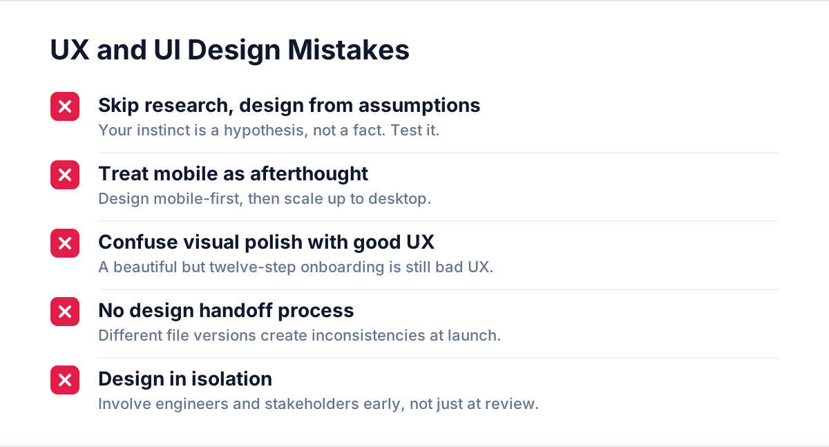
- Skipping research and designing from assumptions. Your instinct about what users want is a hypothesis, not a fact. Test it.
- Treating mobile as an afterthought. Design mobile-first, then scale up to desktop. The constraints of a small screen force clarity that benefits every breakpoint.
- Confusing visual polish with good UX. A beautifully designed onboarding flow that takes twelve steps to complete is still bad UX.
- No design handoff process. Designers and developers working from different versions of the same file create inconsistencies at launch. A single source of truth in your design tool, with annotated specs, is non-negotiable.
- Designing in isolation. UX and UI work is most effective when product managers, engineers, and stakeholders are involved early, not just at the review stage.
How to Evaluate Whether Your Current Design Is Working
You do not need to rebuild everything to find out where your design is failing. Start here:
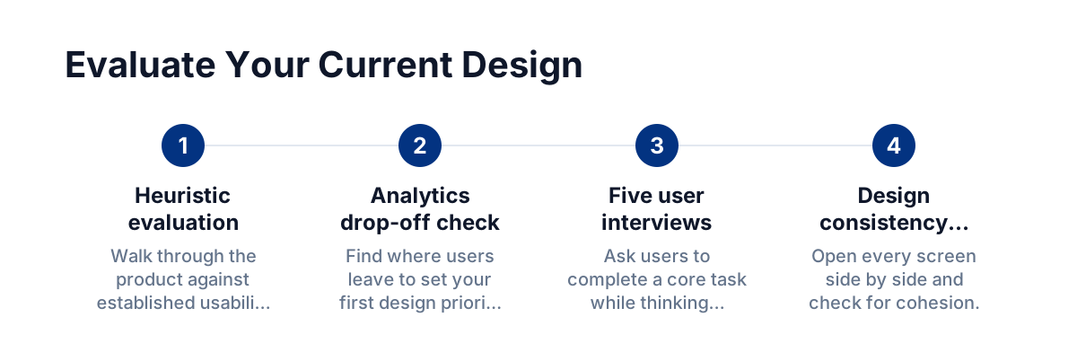
- Run a heuristic evaluation. Walk through your product against established usability principles: is the system status always visible? Are errors easy to recover from? Is the language user-centered?
- Check your analytics for drop-off points. Where do users leave? That is your first design priority.
- Conduct five quick user interviews. Ask users to complete a core task while thinking aloud. You will surface issues no heatmap can show you.
- Audit your design consistency. Open every screen side by side. Do they feel like they belong to the same product? Inconsistency is a trust issue.
FAQ
What is the difference between UX design and UI design in one sentence?
UX design shapes how a product works and flows for the user; UI design determines how it looks and feels visually. Both are required for a product that is both usable and enjoyable.
Do startups need to invest in UX and UI design before building?
Yes, and the earlier the better. Designing and validating flows before writing code prevents expensive rework, reduces time to market, and produces a product users actually want to use from day one.
How long does a UX and UI design process typically take?
For a focused MVP scope, a thorough UX research and wireframing phase can take two to four weeks, followed by two to four weeks of UI design and prototyping. Complex enterprise products take longer, but rushing either phase almost always costs more time in the build phase.
Can good UI design compensate for poor UX?
No. A visually stunning interface built on a confusing or broken user flow still frustrates users. UX must come first. Think of UI as amplifying the experience that UX has already structured correctly.
---
If you are building or redesigning a digital product and want to get the design layer right from the start, the place to begin is a structured UX audit and a clear product brief. The decisions you make in the design phase shape everything that follows in engineering, and they are always cheaper to change on a canvas than in a codebase.