
Best Business Intelligence Visualization Tools in 2026
 Vladimiros Mykogian3 Αυγούστου 2026
The best business intelligence visualization tools transform raw, messy data into clear, actionable decisions by presenting it in charts, dashboards, and interactive reports that non-technical stakeholders can actually use. If your team is still making strategic calls based on gut feel or static spreadsheets, the right BI visualization layer is the single highest-leverage upgrade you can make to your decision-making process.
This guide cuts through the noise and gives you a practical framework for evaluating and choosing the right business intelligence visualization tools for your company's stage, team, and data stack.
Why Business Intelligence Visualization Actually Matters
Data without visual context is just noise. A column of 10,000 revenue figures tells you nothing at a glance. A line chart showing a 23% dip in retention after a feature release tells you exactly where to focus next sprint.
Good BI visualization does three concrete things:
- Compresses time to insight. A well-built dashboard can surface a trend in seconds that would take an analyst hours to find manually.
- Democratizes data. When a founder or product manager can self-serve answers without filing a data request, your whole organization moves faster.
- Creates a shared source of truth. Misaligned metrics between sales, product, and finance teams is one of the most common (and quietly expensive) problems in scaling companies.
The bottom line: visualization is not a cosmetic layer on top of your data. It is the interface through which your data becomes strategy.
The Core Categories of Business Intelligence Visualization Tools
Not all business intelligence visualization tools are built for the same job. Before evaluating any specific option, understand which category fits your situation.
Embedded Analytics Platforms
These are designed to be built directly into your product or internal app. If you are a SaaS founder who wants to give customers their own dashboards, this is the category you need. They connect to your database and render charts inside your existing UI.
Self-Service BI Platforms
These are standalone tools where business users drag and drop to build their own reports. They connect to multiple data sources and are designed so that analysts, not engineers, do the day-to-day work. They are ideal for operations teams, finance leads, and growth managers who need daily visibility without developer support.
Developer-First, Code-Based Libraries
For teams that want pixel-perfect control, open-source JavaScript charting libraries let engineers build exactly the visualization experience they envision. The tradeoff is build time and ongoing maintenance.
Augmented Analytics Tools
The newest category, these layer AI and natural language processing on top of your data so users can type a question ("What was our churn rate in Q2?") and get a chart back. In 2026, this category is maturing rapidly and is worth serious consideration for non-technical teams.
What to Look for When Evaluating BI Visualization Tools
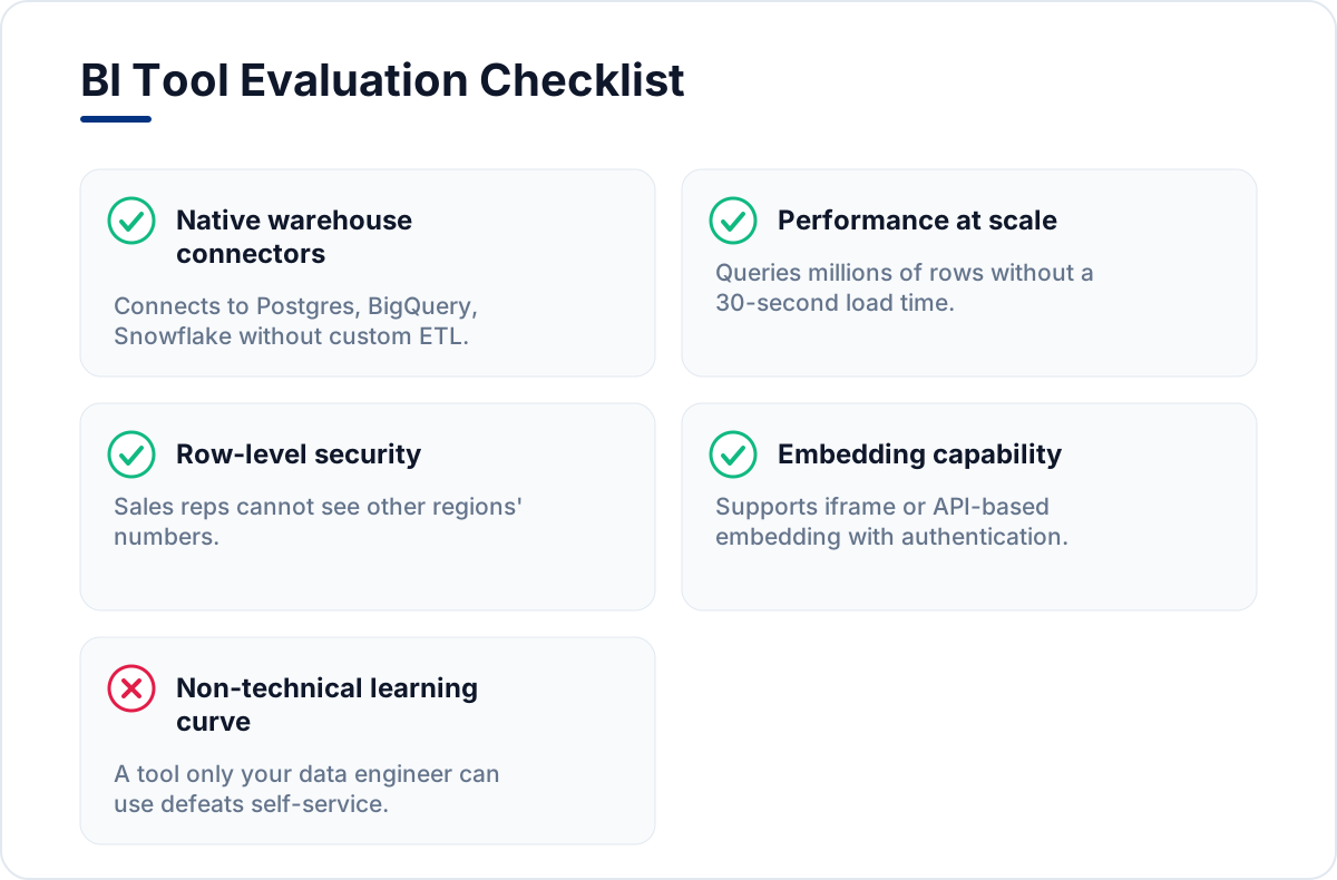
Choosing the wrong tool is a six-month mistake. Use this checklist before you commit:
- Data source connectors. Does it natively connect to your warehouse (Postgres, BigQuery, Snowflake, etc.) without a custom ETL pipeline?
- Performance at scale. Can it query millions of rows without a 30-second load time? Ask for benchmarks, not just promises.
- Permissions and row-level security. Enterprise teams need to ensure a sales rep in one region cannot see another region's numbers. This is non-negotiable.
- Embedding capability. If you want to expose dashboards to customers or external stakeholders, the tool must support iframe or API-based embedding with proper authentication.
- Total cost of ownership. Licensing fees are just the starting point. Factor in the engineering hours to set up, maintain, and customize the tool over 12 months.
- Learning curve for non-technical users. A powerful tool that only your data engineer can operate defeats the self-service goal entirely.
The Gartner Analytics and Business Intelligence Platforms review is a useful external reference when stress-testing vendor claims against real-world adoption data, though always verify the latest edition before making a final call.
The Four Types of Visualizations Every Growing Company Needs
Regardless of which business intelligence visualization tools you pick, make sure your dashboards cover these four visualization types. They answer the questions leadership asks most often.
Time-Series Line Charts
Essential for tracking any metric over time: revenue, active users, support ticket volume. These catch trends and anomalies faster than any table.
Funnel Charts
Critical for product and marketing teams. A funnel visualization of your sign-up flow, for example, immediately shows where users are dropping off and by how much. A small SaaS team might discover that 40% of users abandon between email verification and onboarding completion, a finding that is invisible in a raw events table.
Cohort Analysis Tables
These show how different groups of users behave over time. A cohort table comparing January signups versus June signups reveals whether retention is improving with product changes, which is one of the most important metrics for a scaling startup.
Geographic and Segment Heatmaps
When you are operating across multiple markets, a heatmap that color-codes performance by region, plan tier, or customer segment makes patterns visible in seconds.
Common Mistakes Teams Make With BI Visualization
Even with the right business intelligence visualization tools, most teams underuse or misuse their BI setup. Avoid these pitfalls:
- Building dashboards nobody opens. If you cannot name the specific decision a dashboard enables, do not build it. Start with three high-signal dashboards, not thirty.
- Mixing raw data with derived metrics on the same chart. This confuses stakeholders and erodes trust in the data. Keep your definitions clean and documented.
- Ignoring mobile. If your leadership team reviews metrics on their phones between meetings (they do), your dashboards need to be responsive. Many tools handle this poorly by default and require explicit configuration.
- Skipping a data model layer. Connecting a BI tool directly to your production database without a transformation layer is a recipe for slow queries and inconsistent numbers. A lightweight transformation step (even a set of well-maintained SQL views) before your BI layer pays back immediately in speed and reliability.
How Custom Development Fits Into the BI Picture
Off-the-shelf BI platforms cover 80% of use cases well. But there are scenarios where custom-built visualization components make more sense:
- You are embedding analytics directly into a customer-facing product and the branding, UX, and interaction design must match your product exactly.
- You have a unique data model that generic drag-and-drop tools cannot express cleanly.
- You need real-time streaming data (sub-second refresh rates) for operational monitoring.
In these cases, building a custom analytics layer using a modern React-based stack, connecting it to your data warehouse via a purpose-built API, and deploying it as part of your existing cloud infrastructure is often the sharper move. The upfront investment is higher, but the result is a set of business intelligence visualization tools that are genuinely differentiated and maintainable long term.
This is exactly the kind of decision a technical partner who understands both your product and your data architecture can help you make objectively, without pushing you toward a one-size-fits-all answer.
FAQ
What is the difference between a BI tool and a data visualization library?
A BI tool is a complete platform with data connectors, user management, a query builder, and pre-built chart types, designed so that non-engineers can build and share reports. A data visualization library is a code-level toolkit that engineers use to render custom charts inside an application. BI tools are faster to deploy; libraries offer more control.
Do I need a data warehouse before using business intelligence visualization tools?
Not always, but it helps significantly. Many BI tools can connect directly to a production database, but this approach tends to cause slow queries and risks impacting your app's performance. A simple data warehouse or even a read replica is a low-cost step that makes your entire BI layer faster and safer.
How many dashboards should a startup maintain?
Start with three: one for product health (activation, retention, feature usage), one for revenue (MRR, churn, expansion), and one for operational load (support volume, deployment frequency, error rates). Add dashboards only when a specific, recurring decision demands it.
Can AI replace BI visualization tools?
Not yet, and probably not entirely. AI-powered natural language query tools are genuinely useful for ad-hoc questions, but structured dashboards that track the same KPIs consistently over time remain more reliable for operational decision-making. The best setups in 2026 combine both: a stable dashboard layer for ongoing monitoring and an AI query interface for exploratory analysis.
---
Choosing the right business intelligence visualization tools is not about picking the most feature-rich platform. It is about finding the layer that turns your specific data into the decisions your specific team needs to make, quickly and confidently. Start with a clear question you want answered, work backward to the data that answers it, and then choose the tool that surfaces that data with the least friction. If you are building a product where data visibility is a core part of the user experience, it is worth talking to a technical partner who can help you design that layer properly from the start.